Finally constructed it, really like how it turned out. Plan on touching it up in photoshop and adding bottles to it (Just wanted to have a picture up for all to see).
Tuesday, December 14, 2010
Shipyard Pumpkinhead Ale 6 Pack
Finally constructed it, really like how it turned out. Plan on touching it up in photoshop and adding bottles to it (Just wanted to have a picture up for all to see).
Postmodern Poster
I had trouble coming up with some ideas with my quote. I wanted to be colorful and vibrant but also wanted to bring photos in (like a lot of examples I saw). When thinking of great things (such as great design) I thought of Einstein because he had done so many great things so I brought a picture of him. I'm not in love with this, but don't hate it for my first attempt at postmodern. The thing I realized it looks like two different pieces mashed together especially with the green acting as a barrier. This is something I plan on going back and playing with.
Monday, December 13, 2010
Modernism / Postmodernism
Our final project of the class was to illustrate both modernism and postmodernism through a quote. I have two versions of my modernism and am currently finishing up my postmodernism poster (sick the week before finals). It took me a while to decide on what quote I was going to use, I had a bunch of different quotes down, but came down to two different quotes.
This one is a quote I like because I like modernism style. I think it shows it pretty well. I liked this quote better and decided to make the postmodernism poster based on this quote.
I like this quote and tried to make it almost look like Good design = good business. I wanted the is to sort of turn into a =. I also used helvetica font because it is a business formal font.
Finals!
So the semester is coming to a close and with that I'm posting up my last bits of work for my Advance Graphic Publication Design class. Here is my independent project, she wanted something simple that got the point across for her foundation of Lets Rock and Roll for breast cancer. She had a brochure already done, but it was poorly done and had a lot of mistakes and things difficult to read. I went in and changed things around and came up with this.
***Please note the black box will be a photo of my client and the cover will have text above the logo, awaiting both areas from my client. I will repost when I have the information. Also I know there is a set of ( ) because her old lettering was incorrect and put a box. Awaiting confirmation on the letter.***
***Please note the black box will be a photo of my client and the cover will have text above the logo, awaiting both areas from my client. I will repost when I have the information. Also I know there is a set of ( ) because her old lettering was incorrect and put a box. Awaiting confirmation on the letter.***
I am happy with how smooth it went. A lot easier to read than the old brochure, so I think she'll be happy with it.
Monday, November 29, 2010
Thanksgiving Break
Back from break and we know have two weeks to get our projects done! I have two remaining projects the modern and post modern project and the independent project. I plan on finishing the independent project first, I am going to be working on redesigning and brochure for Cancer fundraiser known as Lets Rock and Roll for a Cure. I'm excited to get working and complete this project!
Shipyard Redesign
I finished redesigning the label, box and logo for the Shipyard Pumpkin head ale. Overall I am happy with how it turned out. I will be getting it printed onto and constructing the 6 pack box, but I lost my flash drive (luckily I saved all my work on the computers) so I wont be getting it printed till later this week come pay day.
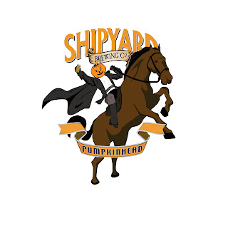 Here is what an earlier version of the logo I had in mind, but ultimately ended up changing it because of the background. They didn't work well together and went and changed things up.
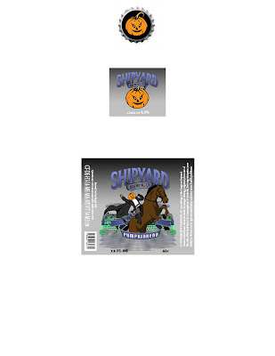
This is the labels and cap for the actual bottle.
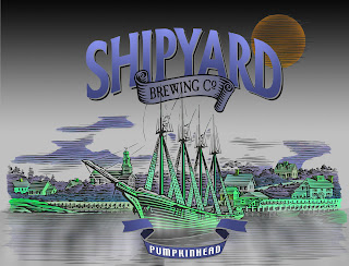
This will be the front of the six pack box.
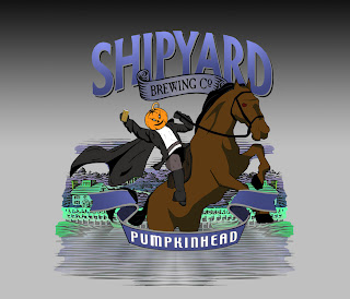
This is a close up of the label.
Overall I am happy with how it turned out. I tried to chance and improve the logo with the horse but keep similar things so that it didn't stray away completely from the original (the head, drink, and the word). I feel the horse and the man on the horse is a better upgrade and I think the background gives it a more halloween feel. This is a seasonal beer and wanted to reflect that in the piece.
 Here is what an earlier version of the logo I had in mind, but ultimately ended up changing it because of the background. They didn't work well together and went and changed things up.


This is the side of the six pack box.
This is the labels and cap for the actual bottle.
This will be the front of the six pack box.
This is a close up of the label.
Overall I am happy with how it turned out. I tried to chance and improve the logo with the horse but keep similar things so that it didn't stray away completely from the original (the head, drink, and the word). I feel the horse and the man on the horse is a better upgrade and I think the background gives it a more halloween feel. This is a seasonal beer and wanted to reflect that in the piece.
Monday, November 8, 2010
Redesign
So far been working on my redesign project and I'm liking how its turning out. This is my progress on the logo itself so far. I plan on going back and painting more colors so its not a flat color for each piece. Think this will make it look even nicer. I need to change how the cape and the horses tail because it is distracting like that. I also am going to play with the location of the text and everything. Note there will be a mug in the pumpkinheads hand. Once this is completed I can attach it to the bottle and 6 pack design I have been working on (on my home computer so I don't have an image to upload. Those are located at a dock with a boat (similar to the shipyard normal beer logo) pulling in. There is a halloween scene with ghost, ghouls and creatures all about.
Wednesday, October 27, 2010
Helvetica
I really enjoyed this movie actually and made me think about typeface in a different perspective. Never really thought about how much really goes into making a typeface and how influential the helvetica typeface is. I for one am not against it like some. It is a very nice font and as shown is very difficult to try to "fix" it.
Monday, October 25, 2010
Repackage ideas
Been trying to think of ways for the redesign and so far thinking of having the pumpkinhead flying over the area (sort of like the headless horsemen). Plan on redoing the horse for that and will probably keep the pumpkinhead they have on him now so people can recognize him. As far as the scene going on I want to have it near a shipyard with possibly a burning boat or a ghost ship to go along with the halloween theme. On the land have ghosts, ghouls, etc wandering around potentially drinking.
Wednesday, October 20, 2010
Package Redesign
After going home for the weekend I've decided to redesign Shipyard's Pumpkin Ale six pack and bottle label. This is their current packaging:
I feel like this is a pretty boring label and box. Nothing really special going on for either design. I want to make it much more fun. A package I absolutely love is the Magic Hat Hex Ourtoberfest beer packaging (had trouble posting the picture on this so had to link). This package is fun and interesting and I think since its a seasonable beer its nice to stray away from their standard labels. I want to make it more of a scene on the package and to have fun with it. I plan on designing the six pack box, the labels on the bottle, and finally the bottle cap.
Wednesday, October 13, 2010
Packaging Project
On to my next project, I have yet to select a product to repackage. Though I will have one by this weekend. Going home for the weekend and I'm going to browse where I work (a pharmacy) and see what I can redesign. On top of that I plan on going to the local beer distruptor because I think it'd be a lot of fun to redesign a beer package. This would give me a few things to design for; the six pack, the bottle/can design, and other sizes. I think this would keep me very interested and having fun with it.
Book Covers Completed ... finally.
After much indecisiveness I finally got a design for my covers. I designed the entire bookcover without a front page and had both complete up to that point. I then started pondering what I could do for my covers. I almost stalled, but designed on a realistic background, but then edited in photoshop and I created images in Illustrator, which isn't as daunting a program as I had once thought.
I think they both turned out pretty well and after a few prints on black and white I got the size perfectly (luckly it worked out on my final print that cost me $30 at Officemax). After being stuck on coming up with an idea for so long it was finally nice to have an idea and roll with it and it to actually look nice.
In a lot of his mystery novels, Mosley has a common theme of putting a color in the title as this is evident in both books I had to design for. I wanted to intergrade that idea into the design. Originally I had a gradient that you see on the book of the book on the front as well, but this didn't work with the women on the covers and ultimately had to be changed.
Here are some photos taken of my book covers. I think they turned out very nicely.
Arabian Nights
Finished my Arabian Nights poster and really liked how it came out, but unfortunately it was not chosen for reworking. Thought it wasn't selected, I do really enjoy how it came out.
Sunday, October 3, 2010
Fall Break
Went home for break which was nice to have off for a few days. When I was home couldn't work on any projects on the computer, but did do some research for my upcoming project on the redesign a package. Didn't find anything I was in love with, but going to hit Walmart tomorrow to search for a product.
For my Arabian Nights poster I felt very good with my design. The few changes I made from the original after my meeting with Drew was to change the background to a gradient instead of a flat color. This was a simple change that yielded pretty big results. Also changed the Mask and Hammer text to white which made it pop a little more. I hope to be chosen to work on it further more and possibly be selected for the final poster.
My book covers still have some work to get done because of the lack of programs at my house to use. I have all of the things I need on the covers and have most of the places for them selected. I wanted to touch up on my actual design more to make it more appealing. I plan on continuing this tonight and tomorrow. Then finish any touch ups on Tuesday and have them printed for Wednesday nights class.
Monday, August 30, 2010
Easy Rawlins
Both novels are based on the tales of Easy Rawlins, a detective in the LA. He is an african american and starts out as a new detective (Devil in the Blue Dress). I'm thinking for now potentially having a cover scheme involving him or something hinting at detective work.
Blog Created
Just made my blog for Advance Graphic Design class at SUNY Oneonta. Our first project is to design and create two dust covers for two separate novels. I was assigned Devil in a Blue Dress and Little Scarlet, but written by Walter Mosley.
Subscribe to:
Comments (Atom)


